Typography as Expression
Understanding how typeface selection communicates brand essence.
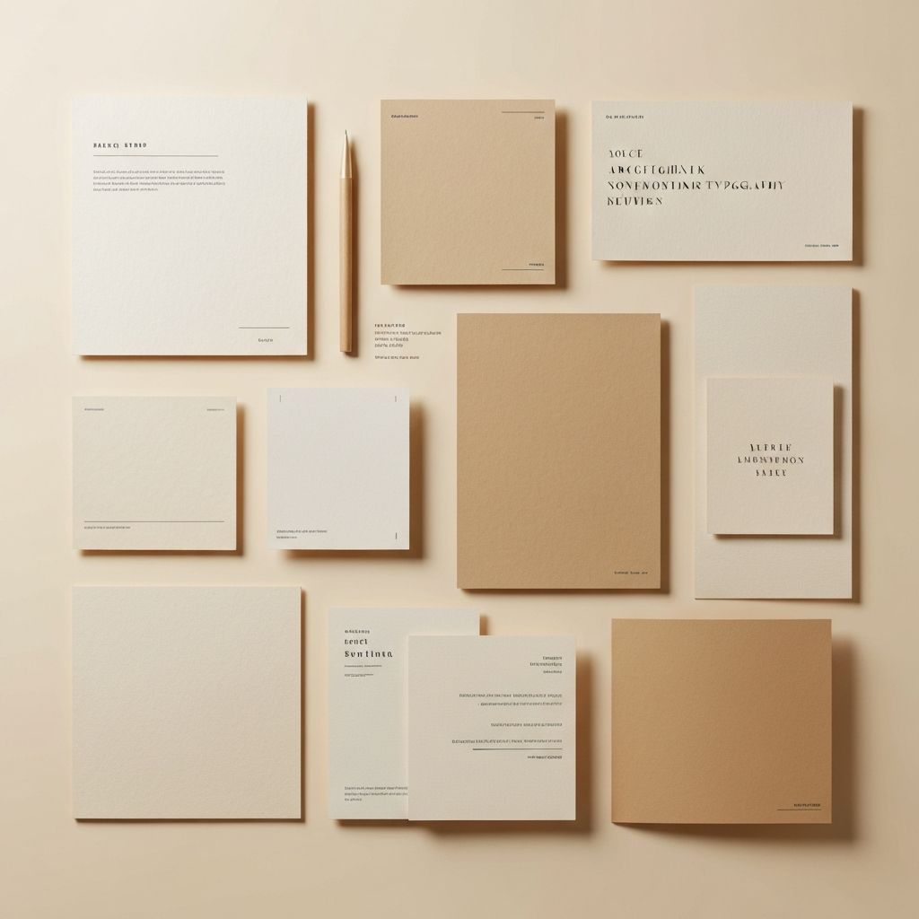
Typography is perhaps the most underestimated element of visual communication. Far beyond mere readability, the selection and arrangement of type conveys mood, personality, and intention before a single word is read.
Each typeface carries its own history, its own voice. A serif font whispers of tradition and authority, while a geometric sans-serif speaks to modernity and clarity. Understanding these associations allows designers to layer meaning, creating communication that operates on multiple levels simultaneously.
The space between letters, the rhythm of line breaks, the dance of positive and negative space—these micro-decisions compound to create macro-impact. Typography is not just about choosing a font; it's about orchestrating an experience that guides the reader through content with intention and grace.
Consider how the great editorial designers use type to create visual hierarchy, to pace the reading experience, to establish personality. Their work demonstrates that typography is not a neutral vessel for content but an active participant in meaning-making.